Yesterday we had a class showing of our pratical which gave us a chance to get some feedback, both from the teachers and from the class.
For our trailer we had possitvie feedback, students said that they liked the make up we used, they liked the mise en scene and they also liked the fast paced editing in the second half of the film. One student said that they didn't like one particular shot of a hand as they thought it would look better closer. The teachers also said that they liked our editing and they thought the mise en scene created in the first half of the trailer works really well.
For our poster we had alot of positive feedback, students said that they liked our background as it suited our horror genre and they said that our image is very striking and caught their attention. Teachers said that they liked our tagline as it was catchy; 'clawing it's way to a cinema near you'.
Our magazine cover had mixed reactions as our image is quite big and 'in your face' students thought that with the text it looked too busy and that the text was too spread over the cover, they also said that it would look better on a black background rather then a white one so we have changed it to a black background with white writing, we think that this looks better as the white makes the image stand out and makes the red on her face stand out aswell.
Thursday, 17 December 2009
Wednesday, 16 December 2009
Class feedback on magazine cover.
Looking at the magazine our class said that the text on the magazine is too orange and the different reds do not blend well together. they suggested that we have a black background with a white title. Or a more dull background rather than plain white.
Thursday, 10 December 2009
FINISHED FILM MAGAZINE!
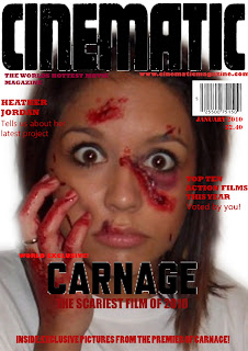

This is our finished film magazine, we had finished the main part of the magazine, as in the mast head, and all the other text parts of the magazine. However we didnt know whether to use a colour image, or to use a black and white one. So we asked 8 people for their views on witch one should be chosen. They all agreed that the colour version was alot better.
I have uploaded both versions, the colour version being the final copy, and the black and white one to show the development. We created our magazine on photoshop. We used an image of one of the charachters from our actual trailer from one of the pictures we took on the day that we shot our footage as the actors where still wearing the special effects make-up, which played a large part in all of our work as it is the main thing that shocks and interests the audience. It also links our main task to our anciliry tasks. We went for the colour scheme of reds and blacks as they are strong bold colours. We used this colour scheme not only because it is a strong colour that stands out, but also from our research we found that film magazines always had strong, bold colours that stand out and typography that gave a sterdy strong look. We also thought the red colour scheme went well with the make-up special effects as the blood is picked out by the contrast to the white of the background. This makes the image really striking and stand out very well. For the masthead we decided we needed a bold font in a dark colour that would stand out on a shelf and look professional. We didnt have much luck finding a suitable font on photoshop, so we looked on myfont.com to search for a more suitable one. We found many but the one we used particularly stood out to us as it had a cracked sort of effect round the outside and stood out as a "statement" font. We thought it really worked as a masthead. We decided on the masthead being black, and thats the only black we would use on it so it stands out even more. We looked to other film magazines to look at the sort of things that are presented on the front cover of magazines, so we added the month and year of the magazine, a tagline, a price, and a barcode. These are the things that would appear on the magazine monthly, without fail. The rest of the text is linked to the current issue. For example the biggest feature is the new relese, which happens to be our film "Carnage". We also feature the name of the actress, and competitions and other things linked to the genre, for example" best horrors..".
Labels:
audience,
collette,
colour scheme,
faye,
film magazine,
images,
magazine cover,
myfont.com,
nat,
typography
Wednesday, 9 December 2009
update :)
It is our deadline on Friday and we our very nearly finished, we have finsihed our first draft for our magazine and we have finished our first draft for our poster, we just need to finish the music on our trailer and we have finished! :D
Claude Levi-Strauss’s Theory and applying it the horror genre
Levi-Strauss argued narrative has two main characteristics which are:
1) It’s made of units that are put together according to certain rules.
2) These units form relations with each other, based on opposites, which provide the basis of the structure.
This theory is known as binary opposition. These opposites are mainly in conflict in the narrative and that was where the crisis of the narrative lay.
Below we have made a list of some of the opposites within the genre of horror:
Good-Evil
Victim-Killer
Danger-Safety
Imprisoned-Freedom
Fear-Relief
Life-Death
Insanity-Sanity
Labels:
collette,
faye,
horror genre,
Levi strauss,
Narrative theory,
nat
todorov :)
Todorov talked about narrative in relation to media. He said that in every film they is an equilibrium to start with, then a desruption which then leads to the new equilibruim. This apply's to our trailer also, you see that the equilibruim is the serial killer making plans, then the disruption is him taking and possbily killing the girls and then the new equilibrum would be the consequences of the serial killers actions, maybe being arrested.
Labels:
collette,
disruption,
equilibruim,
faye,
nat,
new equilibruim,
theory,
todorov
Tuesday, 8 December 2009
Vladimir Propp’s Theory: Application to Scream (1997, Wes Craven)
Vladimir Propp suggested that there is a series of actions that can be identified in narratives. They are normally connected with a hidden fairytale or myth narratives. We have applied the theory to "scream".
Preparation
Casey is killed at the very beginning of the film. This takes the audience straight into the action, however there is preparation when Casey talks to her killer on the phone. It could also be preparing the audience for the deaths that will soon come in the film.
Complication
The killer attempts to kill the main character Sidney. She receives a phone call and is then chased up the stairs of her house by the killer. The killer is unsuccessful but Sidney is now aware that somebody is trying to kill her. She thinks it is her boyfriend, Billy, so police question him.
Transference
Billy, who is one of the killers, is found to be innocent and is released. Stu invites Sidney to a party and she goes. Sidney does no know that Stu is one of the killers and this is his plan to get her to a location where they can successfully kill her.
Struggle
The killer supposedly kills Billy and proceeds to chase Sidney. She has narrow escapes including climbing out of a window. She escapes the killer again outside the house by going back inside. And finally the truth is revealed.
Return
Sidney and Gale manages to kill both of the killers. Sidney then releases her father who has been held hostage. She is now out of danger and her father has been returned to her.
Recognition
In the final scene, Gale is reporting the story on her news channel. Everyone will now know the identity of the killers and what actually happened.
Monday, 7 December 2009
Poster edits.
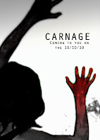
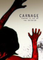

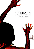
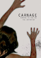 We used picasa to manipulate and edit the images to see which effects look the best to fit our specific genre. From looking at these effects we decided to keep our final draft the same and without these effects; because we felt that they were too dark and didn't quite have the disorted effect that we wanted.
DEADLINE APPROACHING!
This is the last week we have on our pratical coursework to make it the best we possibly can. We have finished the majority of our main task which is the trailer for our horror film, we just need to finalise what sound track we need to use and add that, however we have found many that are useable, so we will upload these and comment on their suitiblity for the trailer. We have finished our film poster which we are very proud of. We have acheived exactly what we wanted to from thr initial idea through to completion of the poster- we have also recieved quite good feedback from peers and other teachers which has all been positive. We are currently in the process of finshing our film magazine.
Labels:
collette,
faye,
film magazine,
nat,
Soundtrack,
trailer,
updates
Thursday, 3 December 2009
magazine fonts
Subscribe to:
Comments (Atom)
