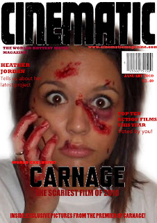

This is our finished film magazine, we had finished the main part of the magazine, as in the mast head, and all the other text parts of the magazine. However we didnt know whether to use a colour image, or to use a black and white one. So we asked 8 people for their views on witch one should be chosen. They all agreed that the colour version was alot better.
I have uploaded both versions, the colour version being the final copy, and the black and white one to show the development. We created our magazine on photoshop. We used an image of one of the charachters from our actual trailer from one of the pictures we took on the day that we shot our footage as the actors where still wearing the special effects make-up, which played a large part in all of our work as it is the main thing that shocks and interests the audience. It also links our main task to our anciliry tasks. We went for the colour scheme of reds and blacks as they are strong bold colours. We used this colour scheme not only because it is a strong colour that stands out, but also from our research we found that film magazines always had strong, bold colours that stand out and typography that gave a sterdy strong look. We also thought the red colour scheme went well with the make-up special effects as the blood is picked out by the contrast to the white of the background. This makes the image really striking and stand out very well. For the masthead we decided we needed a bold font in a dark colour that would stand out on a shelf and look professional. We didnt have much luck finding a suitable font on photoshop, so we looked on myfont.com to search for a more suitable one. We found many but the one we used particularly stood out to us as it had a cracked sort of effect round the outside and stood out as a "statement" font. We thought it really worked as a masthead. We decided on the masthead being black, and thats the only black we would use on it so it stands out even more. We looked to other film magazines to look at the sort of things that are presented on the front cover of magazines, so we added the month and year of the magazine, a tagline, a price, and a barcode. These are the things that would appear on the magazine monthly, without fail. The rest of the text is linked to the current issue. For example the biggest feature is the new relese, which happens to be our film "Carnage". We also feature the name of the actress, and competitions and other things linked to the genre, for example" best horrors..".
No comments:
Post a Comment